YMCA
UX/UI REDESIGN | BRANDING
DURATION
8 Weeks
Apr — May 2020
TEAM
Kiana Hong
Hasib Islam
Matthew Lafergola
MY ROLE
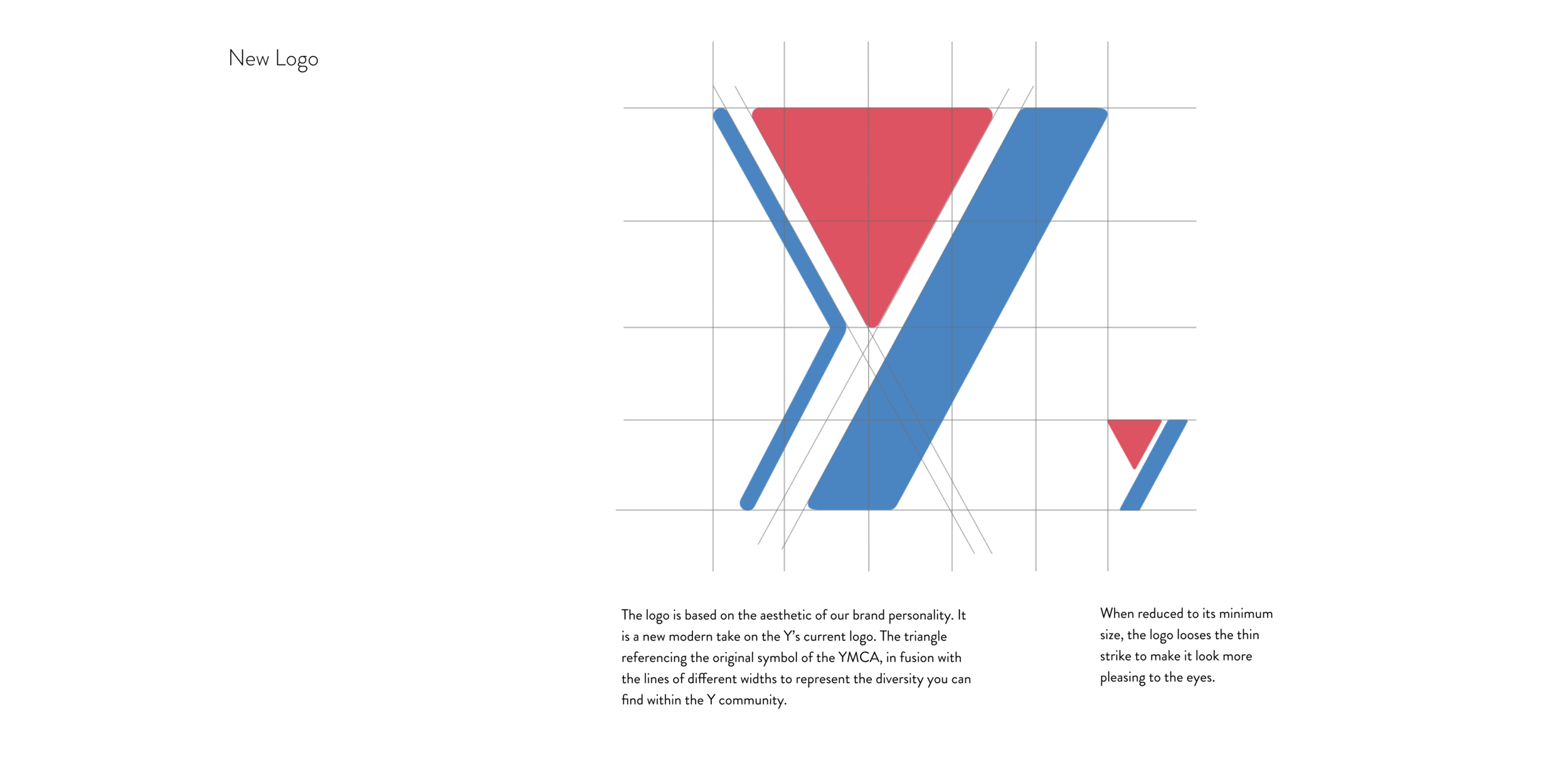
Rebrand: Producing a modern take on YMCA’s original color scheme and morals.
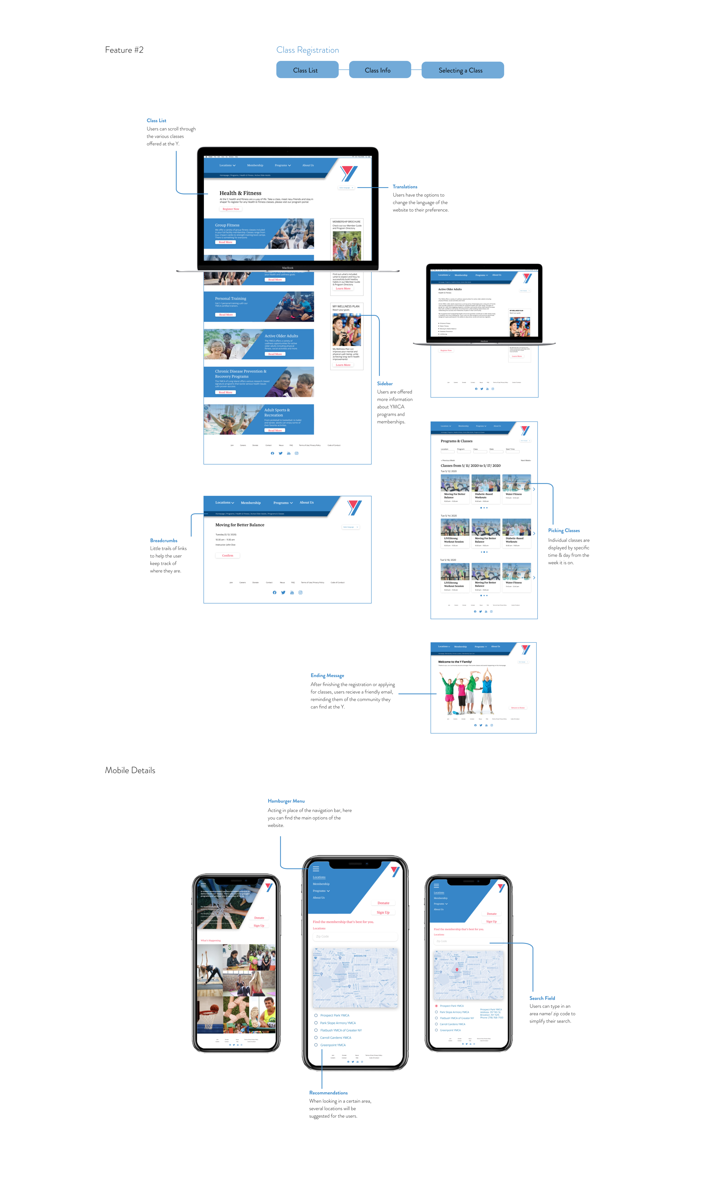
UX/ UI Design: Wireframing with the full content of the original YMCA website, conceptual design development, creating final, responsive designs across desktop and mobile devices.
TOOLS
Adobe XD
Figma
OVERVIEW
THE CHALLENGE
The YMCA believes that the Y represents the youth, although their user interface fails to express their brand manifesto. With outdated graphics, unfocused informational architecture, and pixelated images.
THE SOLUTION
By rebranding the YMCA with a modern twist on its logo, we are able to apply the brand to both the newly incoming youth and the existing older visitors, while corresponding with its brand archetype. Adding more vibrant web design can also reflect the youth and brand manifesto.
Who is the YMCA?
Target Audience
The YMCA is a community-focused non-profit that offers recreational programs & services for all ages. Their focus is on strengthening individuals and communities across the country, connecting people to their purpose, potential, and each other.
For this project, we are focusing on Gen Z users to encourage more visitors at YMCA locations. By having both young and old visitors in the facilities, we can create a more diverse environment and have various programs and activities occur. With this in mind, we also want to prevent ignorance towards the older audience. This older audience included both existing members and newly joined members.
REBRANDING
To be able to rebrand the YMCA, we must understand the ideals and message they want to send.
Big IdeaL
The Y believes the world would be a better place if people had a safe space and programs to enjoy shared passions with all walks of life.
Brand Positioning
For all groups who want a safe community to enjoy shared passions with all walks of life; the Y is a leading nonprofit organization that strengthens communities. They provide a range of services from child care, education leadership programs, recreation centers, social services, advocacy, and many more while they also work comprehensively. So, we can be stronger together as a nation.
Brand Archetype
The Ruler
The Caregiver
Brand Personality
Perceptive
Responsible
Amiable
Caring
Inclusive
Brand Mantra
‘Nurturing communities’

UI DESIGN
Throughout the UI design, the team and I constantly thought about graphics and colors that could make the YMCA website pop with youth without being too overbearing. Using calm, but bold, colors with larger geometric shapes allowed us to do this. The slant motif originated from the slanted shape within the redesigned logo. Using this shape and color also helped to carry the rebrand across platforms.


TAKEAWAYS
BRANDING IS MORE THAN THE LOGO
While creating the new brand of the Y and its UI design, I realized that branding also involves the way certain elements move; micro-interactions! The mini animations and pop-ups add to communicate the brand’s identity.
TEAMWORK MAKES THE DREAM WORK
Being able to work in a group reinforced the efficiency of the project. It also helped to bounce ideas and questions off each other to come to the best option. In addition, the feedback from my other group members helped to strengthen my own work as a designer!
