Grey Poupon
BRANDING
DURATION
5 Months
Jan — May 2021
TEAM
Kiana Hong
Christany Sendar
Brooke Leitner
MY ROLE
Rebrand: Establishing a new color scheme, tone of voice, photography style, package design, social media, and other products with a modern look and feel.
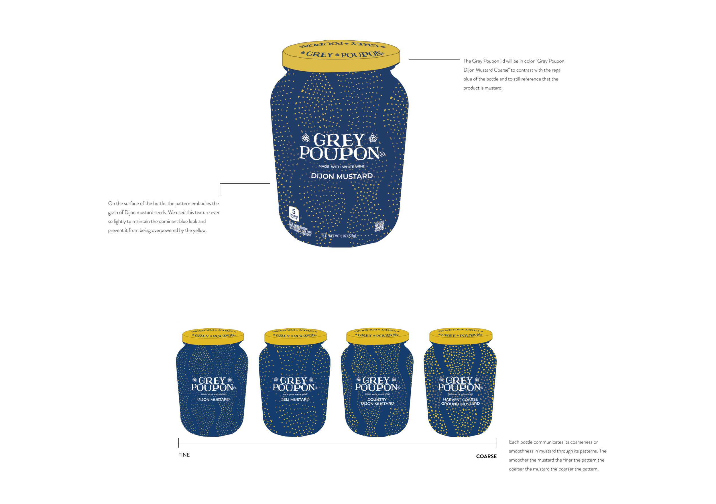
Package Design: Utilizing new branding elements within the physical products to further express Grey Poupon’s renewed self, sketching and digitally composing patterns and visual textures to use as package designs.
Case Study: Creating graphics, storyboarding, and editing the case study video on Adobe After Effects.
TOOLS
Illustrator
After Effects
Figma
OVERVIEW
THE CHALLENGE
Grey Poupon has been a cultural icon since its iconic 1981 release of their '‘Pardon Me” ad, portraying Grey Poupon as one of more affordable ‘the finer things in life’. Although, the brand’s relevance has diminished over the years, along with the Dijon mustard category. Despite its popularity with those over 55, the lack of familiarity with the brand within the millennial generation has pushed Grey Poupon to the back of the fridge. With strict brief guidelines of no changes to the bottle shape or logo, we have to find a way to refresh Grey Poupon visually.
THE SOLUTION
Reintroduce Grey Poupon to millennials by creating a brand refresh that articulates its enduring luxury in the present-day, through its French and vintage roots with the ‘Bleue Standard‘. To stand out from the sea of yellow mustards, we focused on blue dominating the design elements.
WHO IS GREY POUPON?
TARGET AUDIENCE
Grey Poupon is a brand of whole-grain mustard and Dijon mustard.
US-based affluent millennials; people interested in what ingredients go into their foods, striving for healthier alternatives and a sense of luxury that they can attain with their income.
PACKAGING
To distinguish Grey Poupon from a sea of yellow mustard, we challenged ourselves to reconnect with Grey Poupon's French roots and make Grey Poupon identifiable with the color blue. We took inspiration from French cobalt blue glassware, vintage French champagne posters, and the insight that members of the highest order of knighthood wore a blue ribbon. The term "cordon bleu" (blue ribbon) also ties to food prepared to a very high standard by exceptional cooks.

REBRANDING
Bringing together minimalism with the classic French blue, the team and I created several elements to the branding of Grey Poupon to reach a sense of modern luxury. For this project’s brief, we could not touch the logo, which had a vintage look and feel. Therefore, we had to find a modern design compatible with the logo.
TONE OF VOICE
Bold
Excited
Quick-witted
Flirtatious
Entertaining
Grey Poupon's voice is bold about exclaiming their delight in life. They're that friend who slows down to celebrate the little things, spoil the people they love with a good time, attention, and excellent food. To them, luxury doesn't have to be tangible. Luxury is simply taking the time to experience the splendor of life and the people within it.
You'll find that Grey Poupon frequently makes quick-witted statements about composing sumptuous dishes for one (or twenty). They'll wink at their love affair with the art exhibit down the street, and Grey Poupon fully embodies the "soif de vivre" lifestyle.
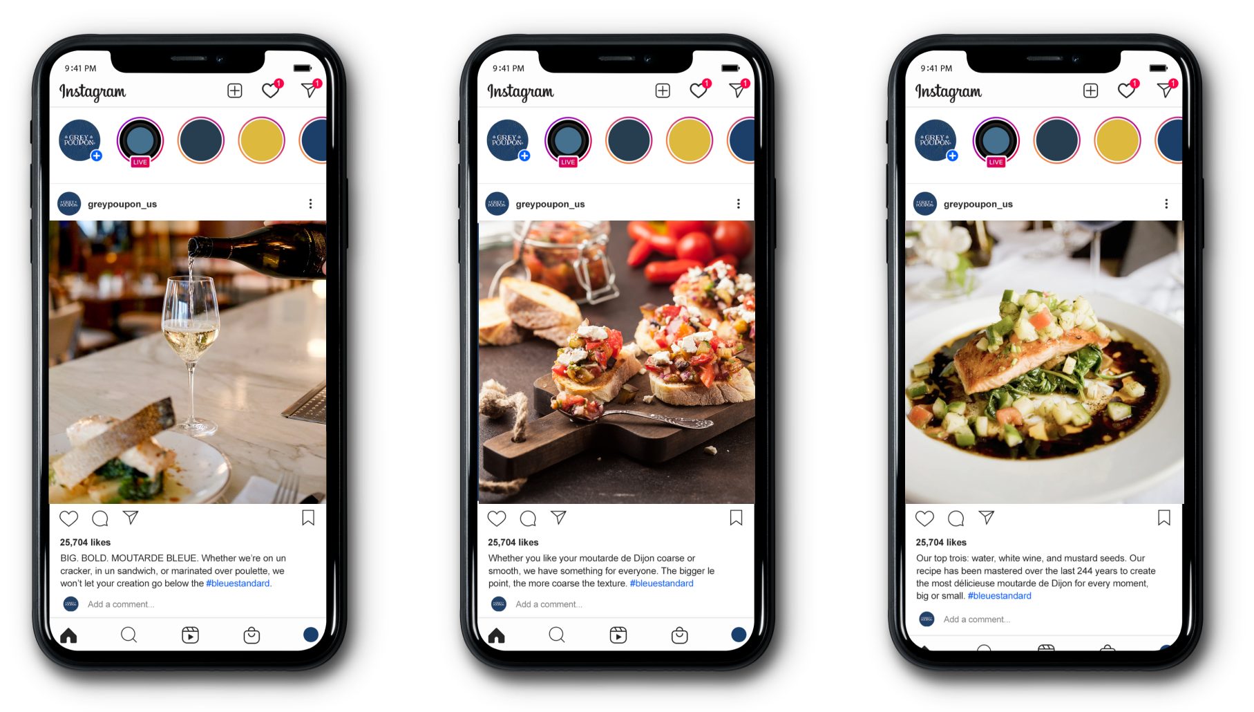
Grey Poupon seeks to entertain by introducing new culinary experiments they've explored to friends with a mouthwatering Insta-post! Their idea of living life to the fullest involves seeking inspiration from art and discovering new ways to apply flavor, texture, color, and love to everyday moments.
PHOTOGRAPHY STYLE
Grey Poupon uses shallow depth of field for photography style and emphasizes the whites and the imagery's warm tones. These warm tones contrast against the cool blues in Grey Poupon's graphics. They also serve as a complementary pairing to the yellows used in the brand colors.
TYPOGRAPHY STYLE
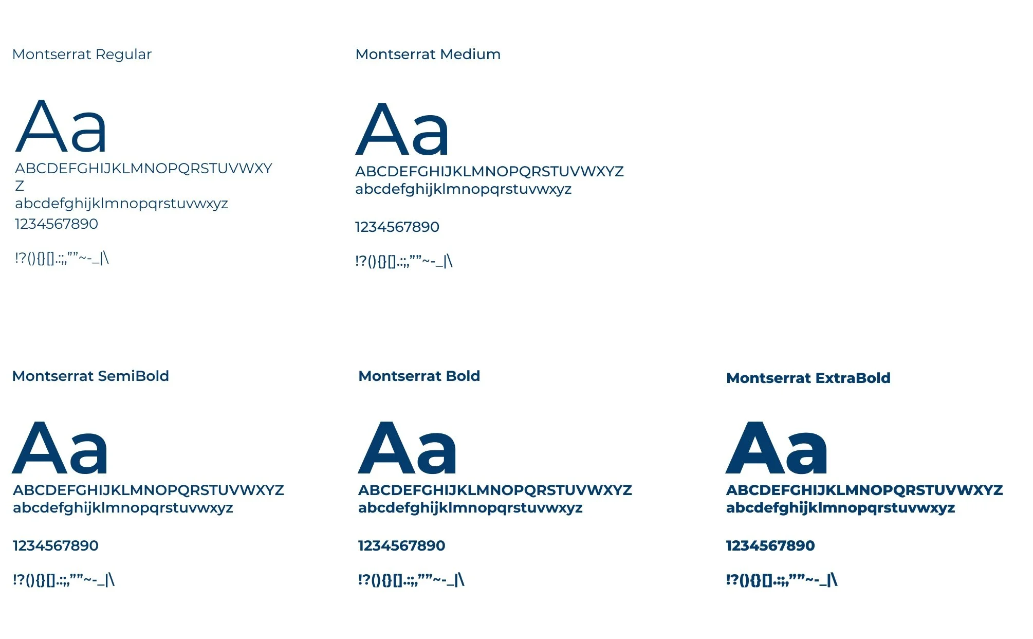
When it comes to typography, we reference the bold sans serif type used in the 20th-century French wine posters, but we modernize the type by omitting the use of outlines and sticking to the clean, bold, and geometric type that is Montserrat.
COLORS & PATTERNS
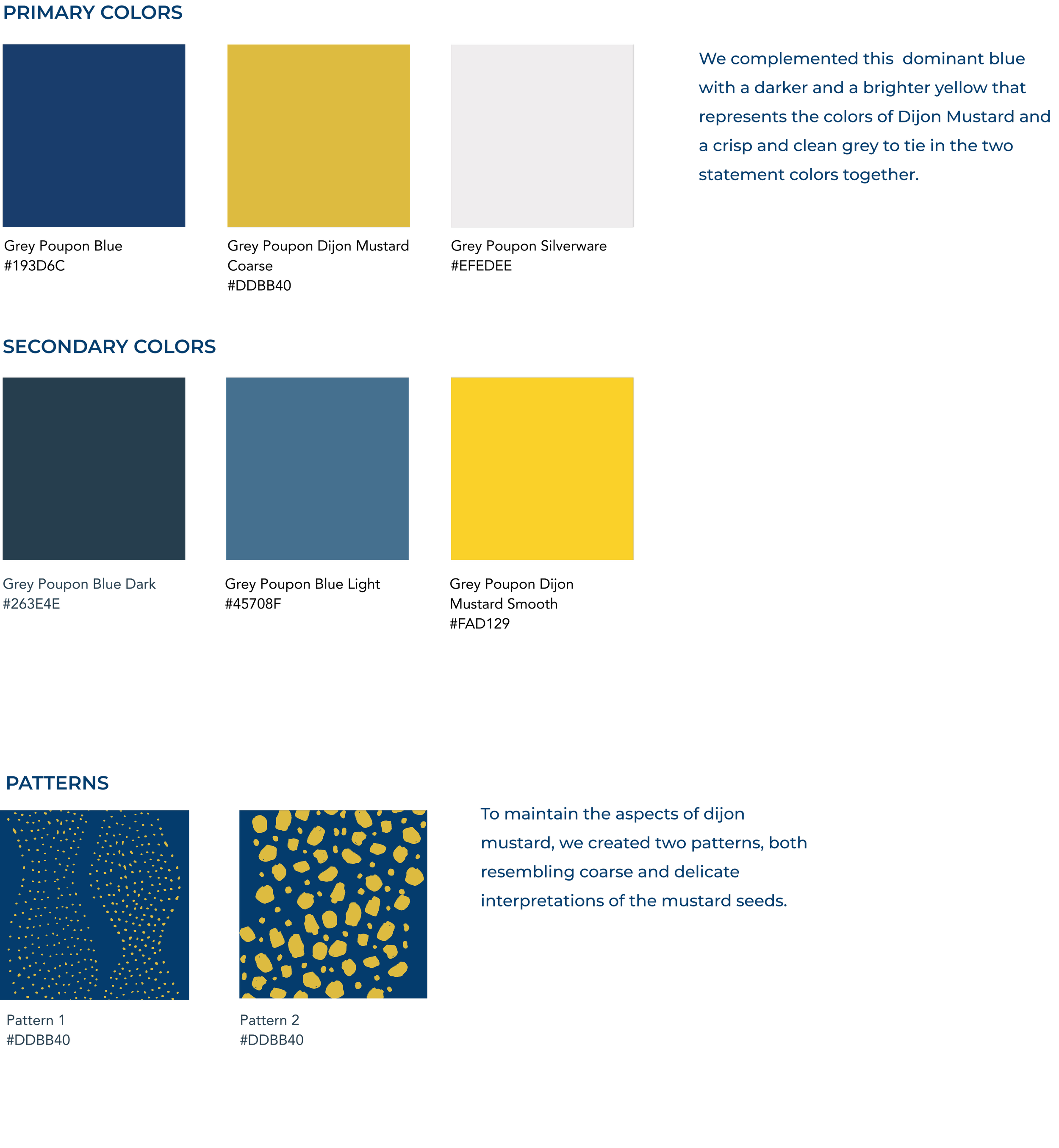
We complemented this dominant blue with a darker and a brighter yellow that represents the colors of Dijon Mustard and a crisp and clean grey to tie in the two statement colors together.
ICONS
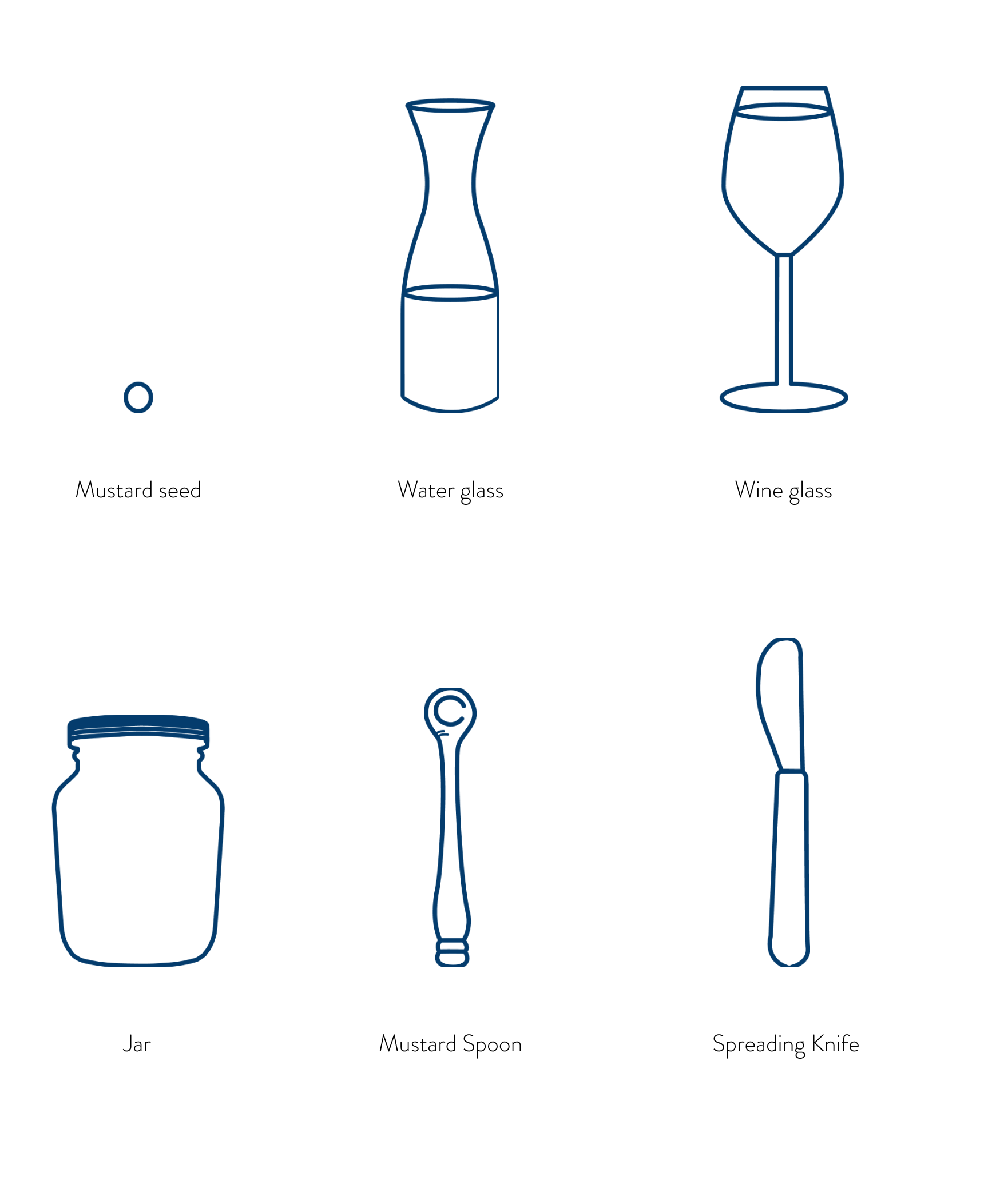
For Grey Poupon, we have six standard icons: the mustard seed, wine glass, and water glass resembling the three main ingredients of Grey Poupon Dijon mustard. The remaining icons are the signature Grey Poupon jar, a mustard spoon, and a spreading knife, essential tools for enjoying every last bit of Grey Poupon.
REBRANDING APPLICATIONS
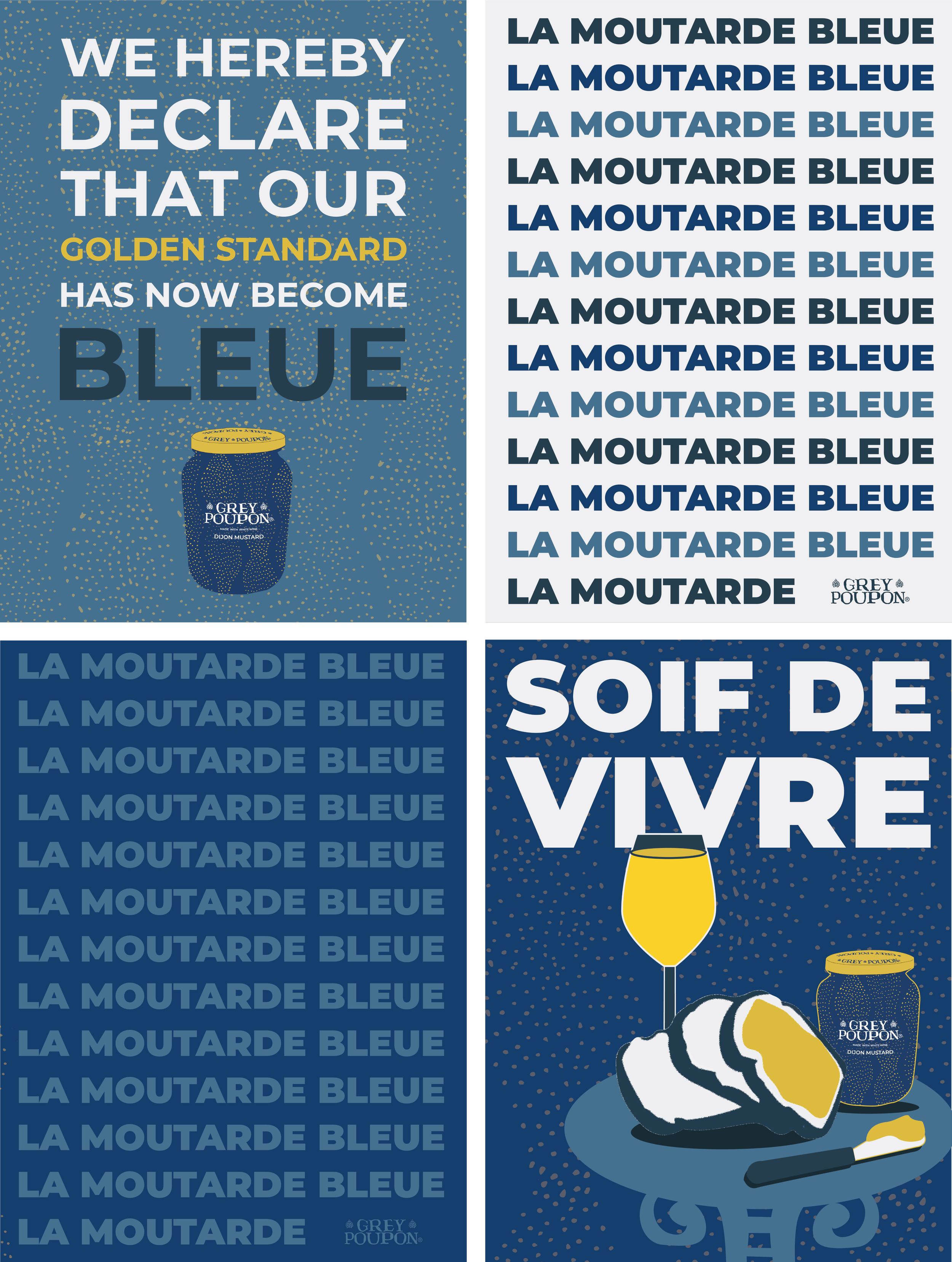
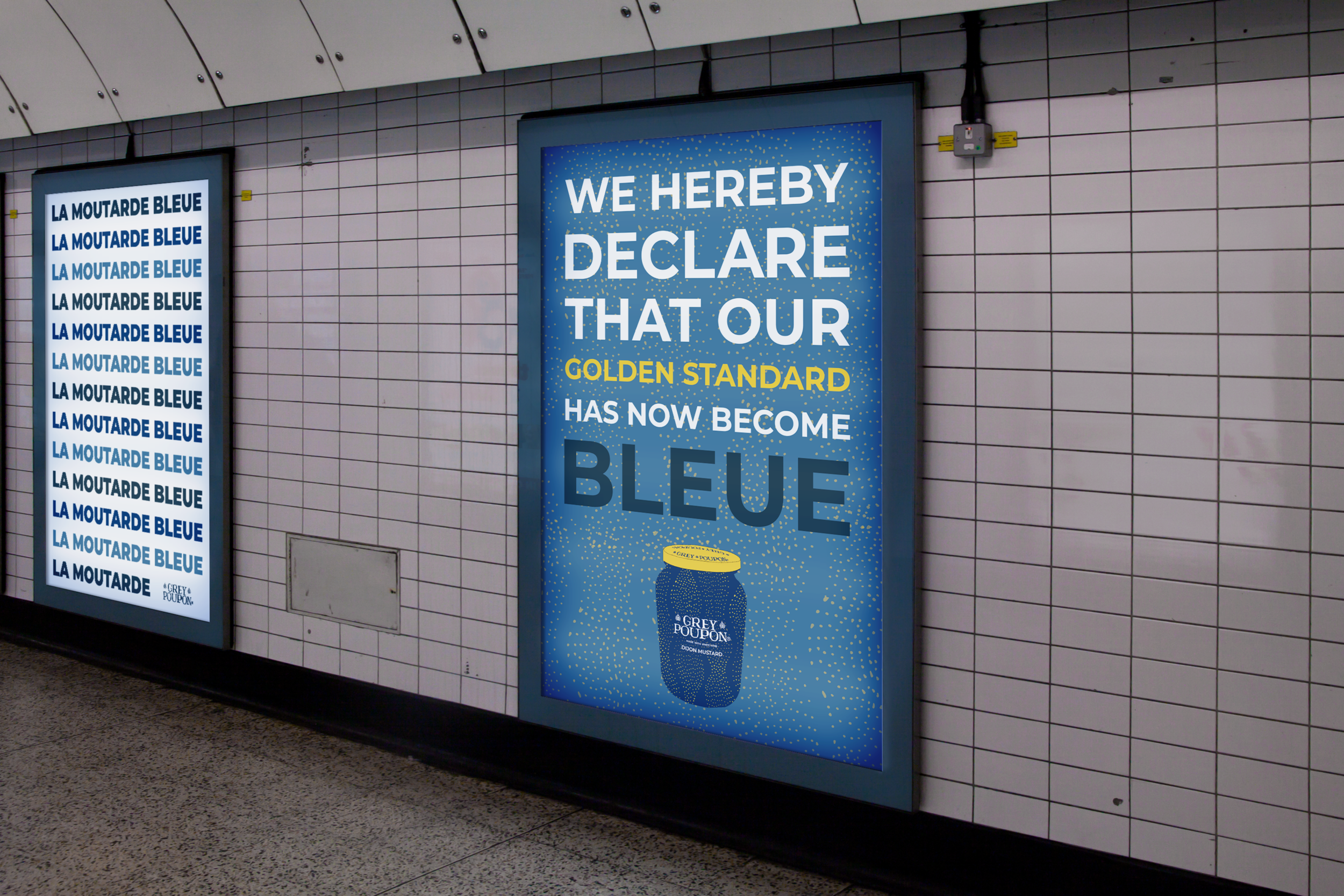
Real-world examples of how the Grey Poupon “Bleue Standard” looks on digital and printed platforms.
PRINTS
Real-world examples of how the Grey Poupon “Bleue Standard” looks on digital and printed platforms.
SOCIAL MEDIA
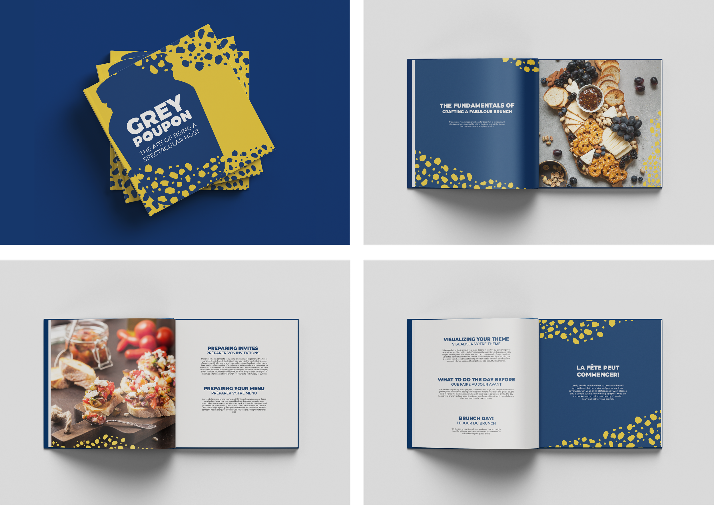
GREY POUPON HANDBOOK: THE ART OF BEING A SPECTACULAR HOST
In efforts of the new branding, Grey Poupon will also have this handbook that provides the readers steps by step guides on how to create, host, and set up splendid events surrounding food, friends and mustard. The handbook is written with the tone of voice in mind, while bringing together Grey Poupon products and the concept of modern luxury for affluent millennials.
Case study
Editing: Kiana Hong
Voiceover: Christany Sendar
Art Direction: Christany Sendar, Kiana Hong, Brooke Leitner
TAKEAWAYS
SOMETIMES YOU GOTTA TRUST YOUR GUT
During the brainstorming process of what the rebrand would look like, the team and I went through many versions— as many projects do. Although, we also had to follow a specific brief and advice from our professor at the time. Even though it was to help us, the team didn’t feel as strong to those ideas. In the end, we decided to do what we thought satisfied our expectations but we ended with something that exceeded them!
TRY NEW THINGS
When finding partners for this project, I chose to reach out to those I haven’t had the chance to work with. Yes, it’s comfortable to work with the same people; you know how each other works, but learning to work with new partners and opening yourself up to their new ideas is also a great way to work! In doing so, I can also practice my teamwork and adaptability skills.
I <3 BRANDING
This was the project that solidified my love for branding :)


