Best Western
REBRANDING
DURATION
3 Months
Mar — May 2021
TEAM
Kiana Hong
Christany Sendar
Alison Quagliato
MY ROLE
Brand Design: Refreshing Best Western’s look and feel, keeping up the “minimal” graphic trends. The setting of style guides, brand guidelines, brand vision, and value proposition for short as well as long term. Creating graphic assets and mockups to bring the brand identity to life.
Research: Gathering content of competitors, looking for what’s missing within the hotel market and what we can do differently, or how we can make Best Western stand out from the rest.
TOOLS
Figma
Adobe Illustrator
WELCOME
Welcome to the BEST WESTERN brand guidelines. The purpose of these guidelines is to provide essential guidance on how to build and maintain a unified, ownable, and successful brand identity. By following these guidelines, you will bring our brand to life by building a seamless experience and a positive perception of BEST WESTERN in our audiences’ minds. These brand guidelines will give direction as you apply our brand principles to the work you do every day.
BRAND STRATEGY
This section presents our brand’s unique personality and purpose, which define our brand’s tone and vision. Personality and purpose serve as internal tools that bring clarity and confidence to internal stakeholders and guide the audiences’ understanding of the brand. Our brand strategy provides a foundation and guides the development of all brand communications.
PERSONALITY
Brand personality, the memorable persona the brand presents to the world, helps bring the brand positioning to life and helps customers form an emotional connection to the brand. It includes how the brand looks, acts, and sounds, but in human terms. Our personality traits set the criteria for developing, as well as evaluating, our verbal and visual identity. They also help us define, in a relevant way, how we behave, what we say, and how we say it.
PURPOSE STATEMENT
The brand purpose is the unifying statement that speaks to our brand’s reason for existence. It is the one expectation that aligns all brand actions, behaviors, and communications. Aspirational and achievable, our brand purpose motivates the long-term goal for the brand.
BRAND IDENTITY SYSTEM
Our brand identity is the overall expression of what we want our customers to see and believe about our brand. That expression comprises a number of visual, verbal, and sensory assets. These brand identity assets are the tools that define our brand and help make us memorable and unique.
DYNAMIC BRANDMARK
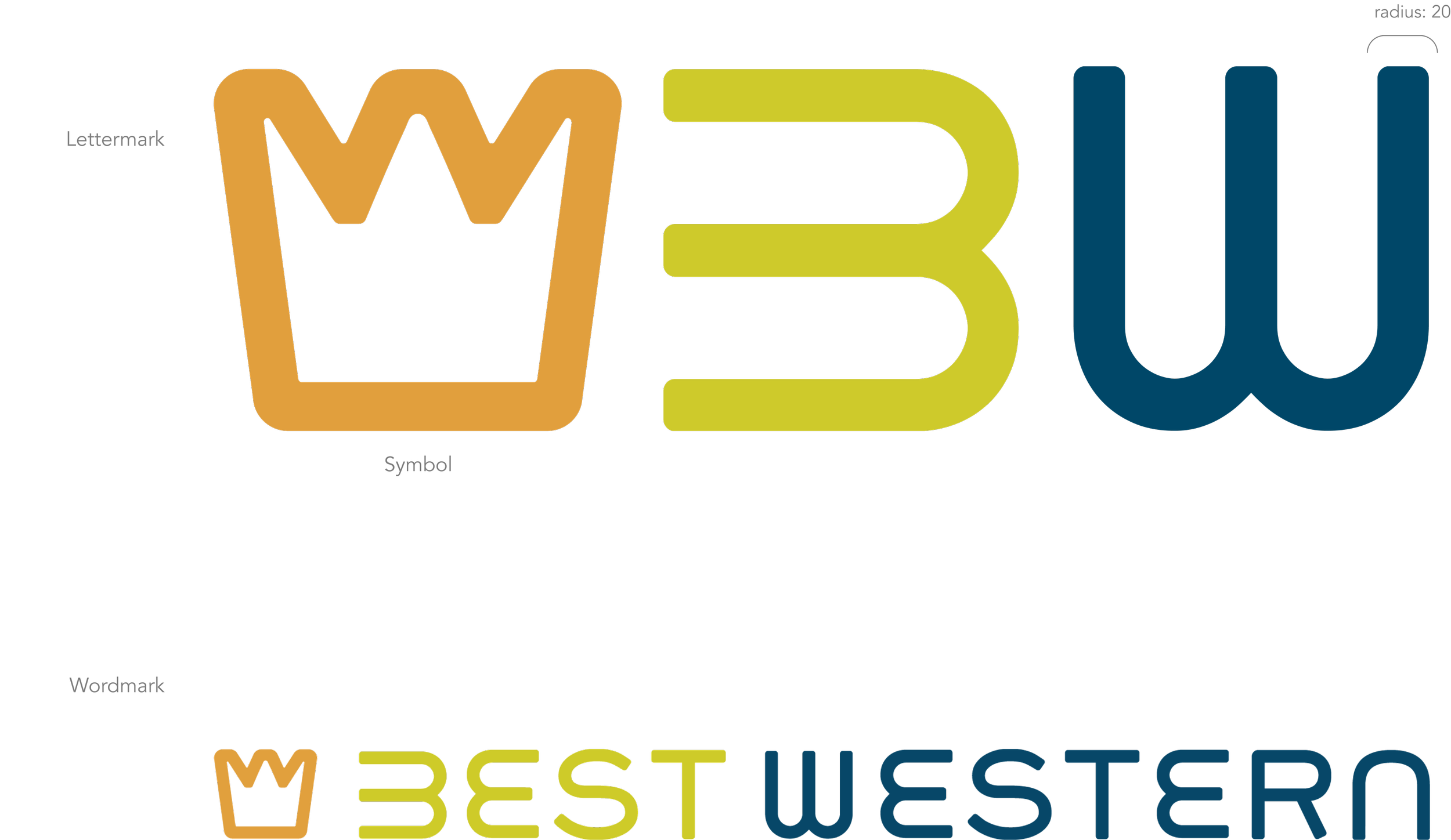
Our primary logo is our lettermark and it is one of our most important visual assets, representing our brand in an ownable and recognizable way. It has been specially designed to symbolize not only our name but also what we stand for. The symbol of the crown illustrates the best of who we are, the best of the services we offer, and the best in our personality. The Best Western logo is composed of two elements: the crown symbol and the best western logotype. These two elements maintain a fixed position and size relationship that should not be altered.
TAGLINE LOCKUP
The best western tagline is “Committed To Giving Our Best To You” and appears 40px under the logo.
CLEAR SPACE AND MINIMUM SIZE
Clear Space Requirement
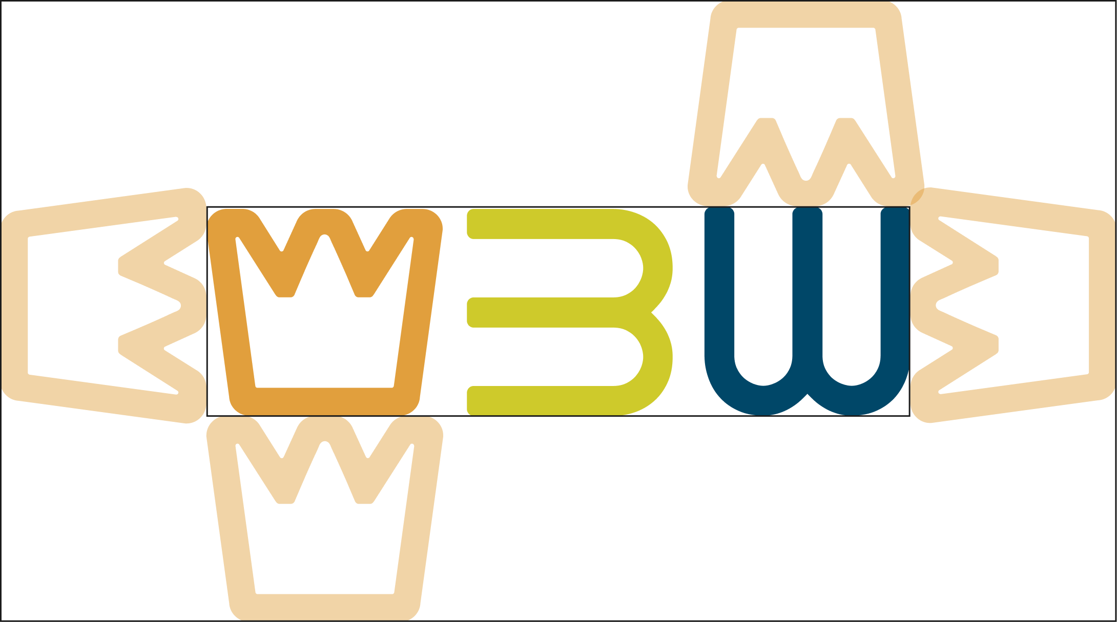
Clear space protects the visual integrity and impact of the logo, separating it from other elements such as headlines, text, imagery, and the outside edge of printed materials. The clear space is equal to the height of the CAPITAL letter “L” in the logotype. A minimum clear space of “L” should be maintained around the entire logo at all times.
Minimum Size Requirement
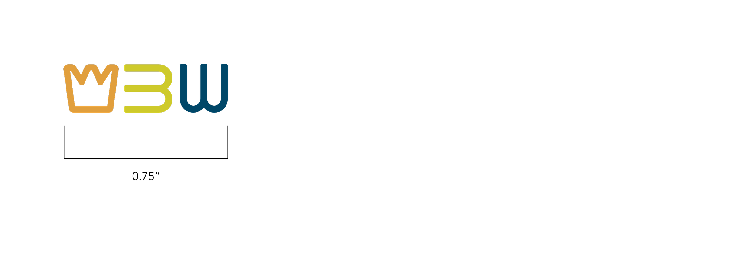
The minimum size of the logo is 0.75˝ (19 mm) in width. To maintain legibility, the logo should not be any smaller.
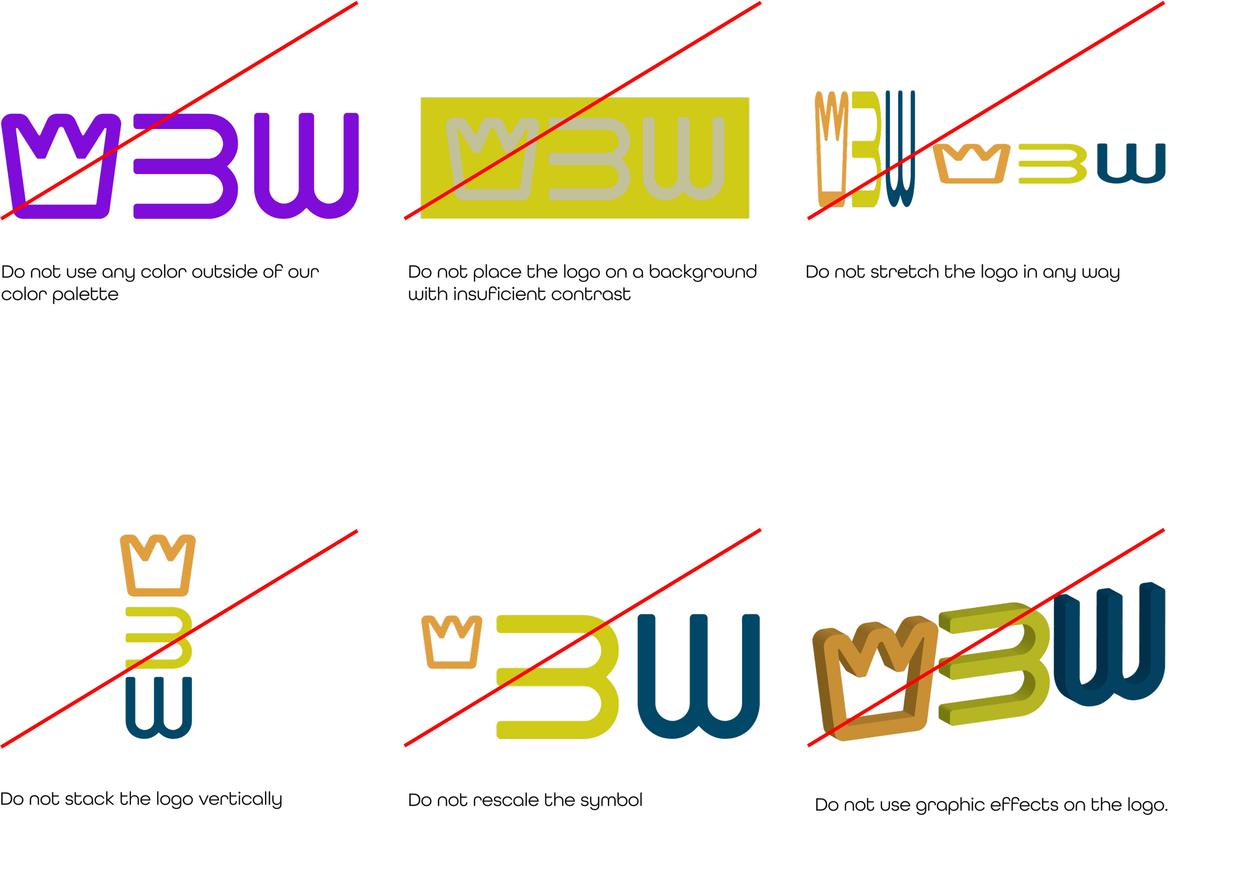
INCORRECT LOGO USE
The composition of our logo and the representation of its components and colors were designed with a specific purpose and should not be altered. This page illustrates some incorrect uses of the logo.
COLORS
Color is a powerful way to express mood or feeling. Our color palette was chosen to help communicate the mood, feeling, and tone of our brand identity. These colors are unique and reflect key attributes of the personality in an enduring and recognizable way. Together, Royal Blue, Golden Crown and Lively Lime comprise our primary color palette.
TYPOGRAPHY
Grover and All Round Gothic are the two typefaces we selected to represent our brand in the best western visual identity system and should be used in all communication materials. Grover is used on short headlines and in our brandmark. All Round Gothic is used for headlines that are longer than three words. Our secondary typeface, All Round Gothic, should be used in body copy and other secondary texts. Both font families offer a range of weights and sizes to help reflect our brand personality with confidence and clarity in all our communications.
CORRECT USE OF TYPOGRAPHY EXAMPLE
Below highlights a few rules to follow when typesetting copy.
- Create an intentional hierarchy
- Use Grover for one-word headlines
- Use Gotham Bold for headlines with 3 or more words
- Use Gotham Book for body copy
- Limit the number of sizes or weights to what is absolutely necessary
- Try to limit to two sizes and weights
- Manually adjust tracking (letterspacing) and leading (line spacing) to create your desired layout look and feel.
ICONOGRAPHY
This section presents our brand’s unique personality through its iconography. These icons serve as indicators of the many services and amenities we provide at best western.
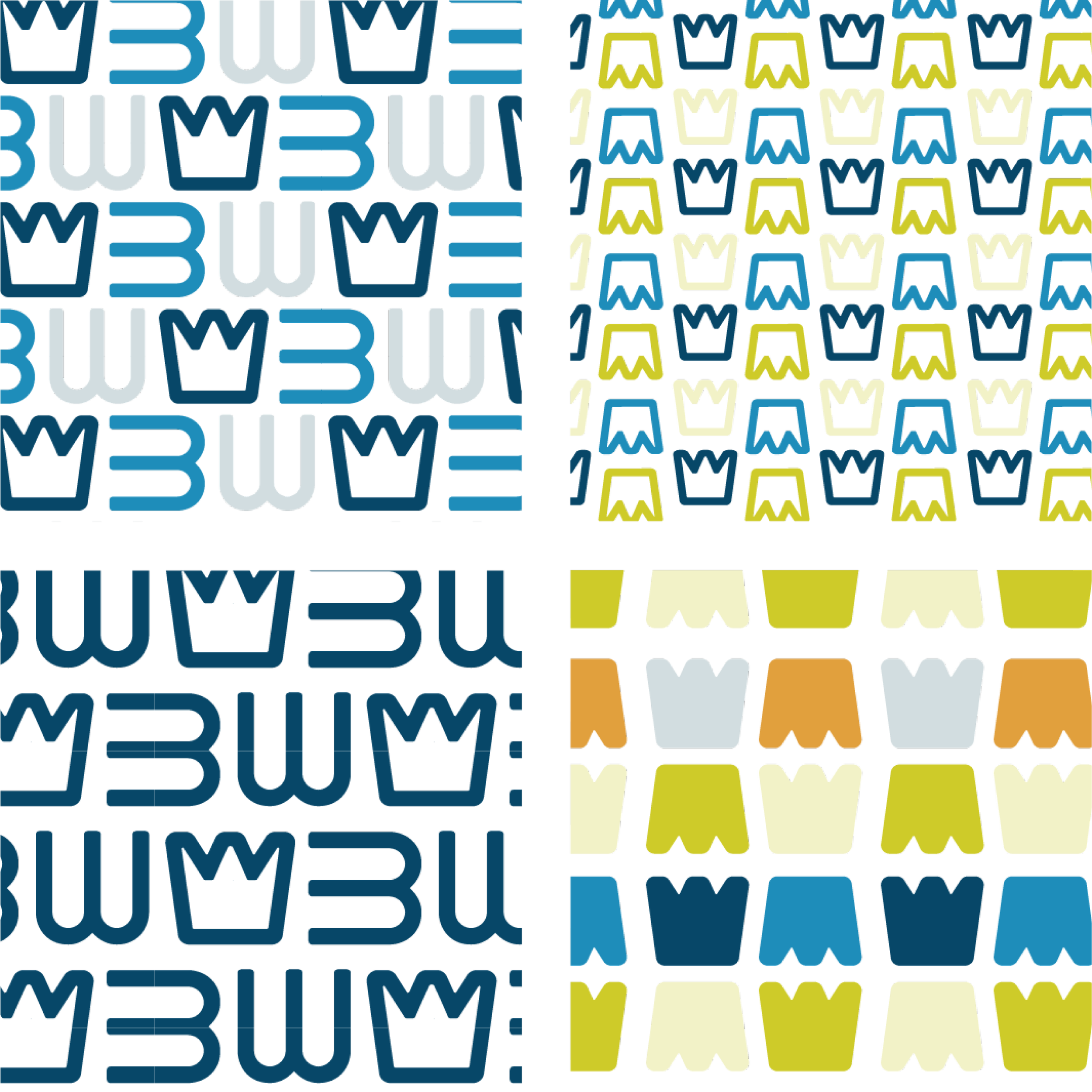
GRAPHIC PATTERNS
This section presents our brand’s unique set of patterns.
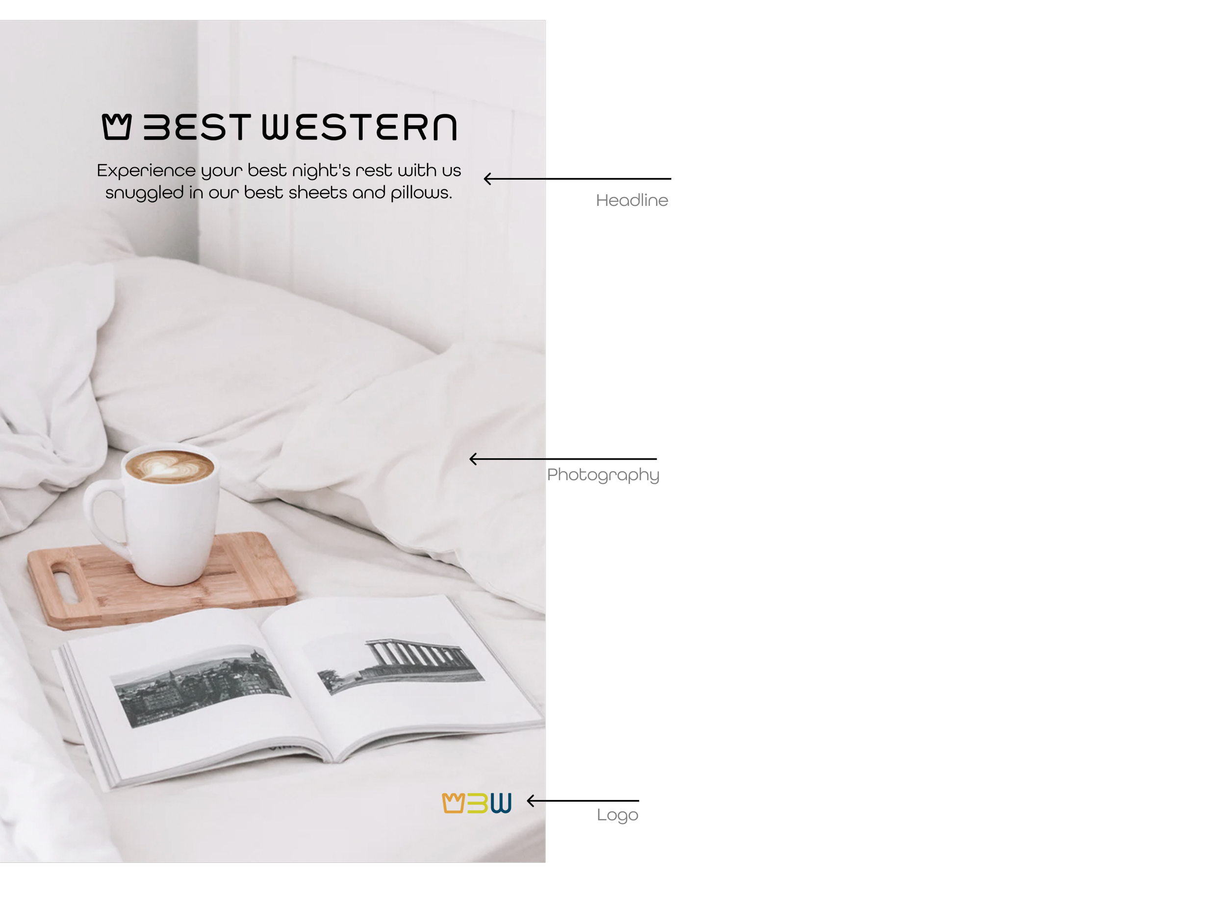
PHOTOGRAPHY STYLE
With our photography we will highlight the accommodations that our locations provide to our guests. The mood will be light and show our welcoming attitude and smiling guests.
In our photography we capture people in motion— interacting and engaging with their environment. We also capture individuals or groups of people as naturally as possible helps maintain a more candid and authentic expression.
The overall look of our photography is warm, light vibrant.
BRAND SYSTEM IN USE
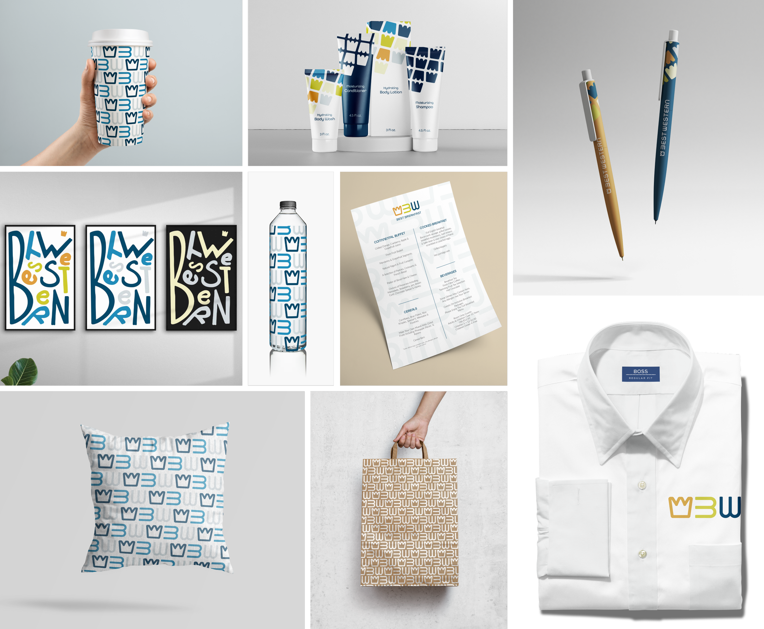
Our brand identity system is the visual structure that unifies our brand identity assets. It organizes our assets in a unique and recognizable way across all our communication channels and touchpoints. This section illustrates how the best western system comes to life in a flexible yet cohesive way.
HOW THE ASSETS WORK TOGETHER
Brand identity systems are the unique way the brand identity assets work together to define and communicate a consistent and own-able look and feel. Our brand identity assets (logo, typeface, color, and secondary graphic) combine to create our brand identity system.
CORRECT USE EXAMPLES
Shown here is a summary of how our brand identity lives together.
CAMPAIGN
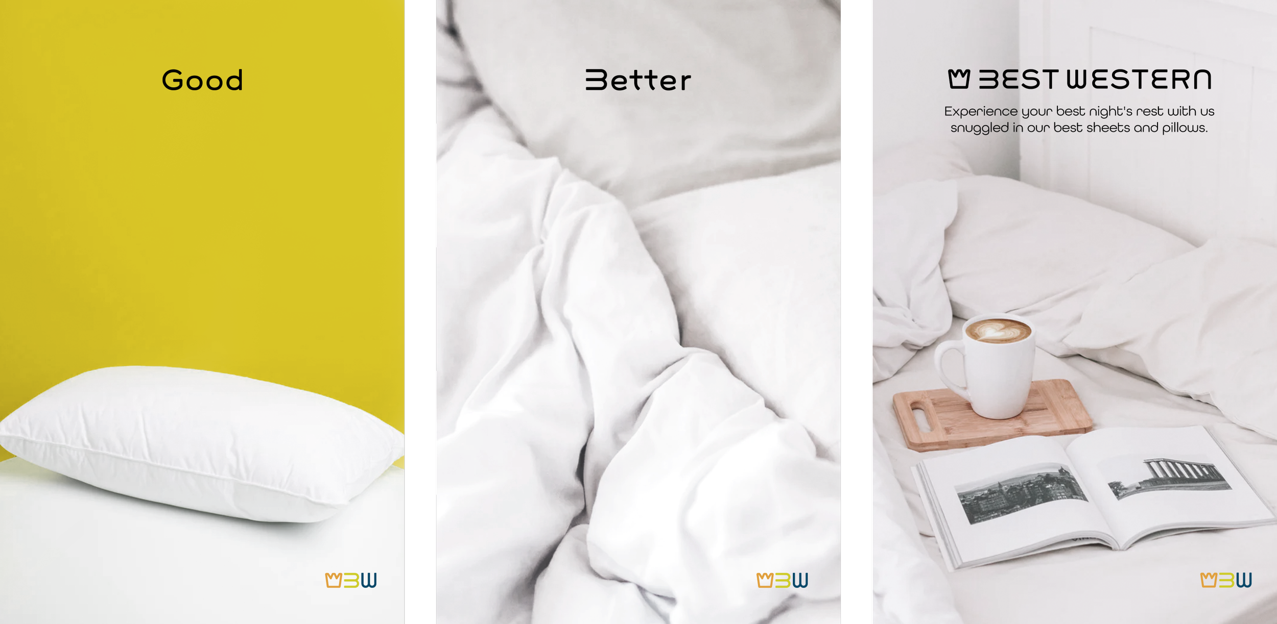
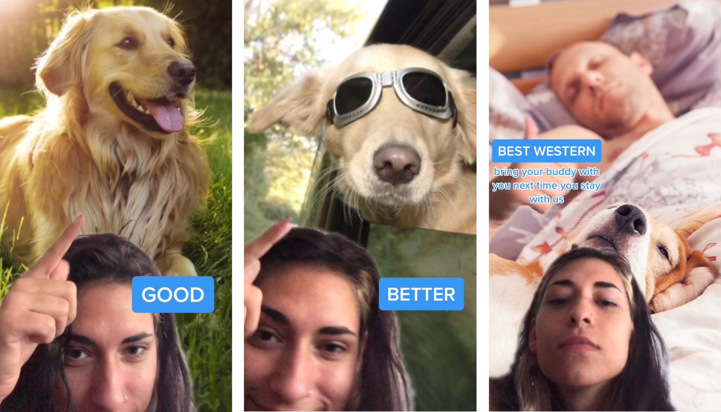
Here at Best Western, we are always there to provide you with our very best service. Our campaign, “Good Better Best Western”, will highlight all that we can do for you. There are things in life that we have that are good on their own, but they are always better when they’re together. Each example will focus on accommodations and other services that our locations provide.
SOCIAL CAROUSEL POST
This is what the campaign looks like on the social media platform Instagram as a carousel post. Each post will specify items and experiences we feel are enjoyable on their own, but better when they are together. With each, we will highlight different services that our locations provide.
SOCIAL STORIES
This is what the campaign looks like on the social media platform Instagram as a story post. These can also be used with other story features on other platforms like Facebook, Twitter, or Snapchat. This post example is a video and will be promoting a new location we are opening. What is shown in our guidelines are static screenshots from this video post.
PRINT POSTERS
This is what the campaign looks like on print advertisements that will be on display in public travel areas like bus and train staions. The posters will be shown together, one after the other.
TIKTOK
This is what the campaign looks like on the social media platform TikTok or on Instagram Reels. Our video will continue to highlight the services we offer at our locations by showing the good, better, and best of a situation.
TAKEAWAYS
STAY CONSISTENT
Throughout the process of this project, my teammates and I kept thinking of ways to expand the assets of the brand system. With three chefs in the kitchen, there were definitely many ideas floating around. This made it difficult to keep the assets organized and on brand. We had to decide which ideas seemed like they were part of the brand book and which ones looked foreign. Ultimately, we were able to boil the content down to what you see today; consistent and on brand!
IT’S OKAY TO RELY ON OTHERS
Working in a group, I’ve learned that everyone has their strengths and weaknesses. I was lucky enough to work with two other talented creatives that balanced out my weaknesses as I did with theirs. If I had a difficult time with a certain aspect of the project, I was able to go to another teammate and have them work it out with me. It’s easy to just get everything done on your own sometimes, but I’ve learned to pause and reach out to my peers for their insights and advice.


